

I started with a couple of counting songs. They're relaxing and meditative, and so they double as behavior management aids--though you can't tell from my first little foray.
I designed a cover--a thumbnail image--and uploaded to TpT.


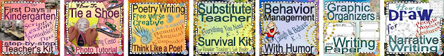
Over time I added bells and whistles and a year later, I uploaded this:

And this:

You can't tell a book by it's cover. Not the whole book, but you can tell plenty.
- Did I take the time to research the common practices and expectations? Yeeesss!
- Did I put a LOT of thought into the composition, colors, and shapes? Um...countless hours.
- Did I sell the "sizzle" as well as the steak? I mean, does the product look cool, and must-have for my targeted audience? Well, it does to me, although I admit I'm biased.
- Large, readable title (on a cell phone, the thumbnail might be less than an inch)
- One or two large images: an eye-catching photo or clip art
- A few key words, not cluttered
- Indicate appropriate grades
- Copyright notice
- Logo in the lower corner, small
- Color-coding; e.g., Math products are blue, ELA yellow
- Repeating elements in all my cover designs:
- Border element
- Image placement
- Artistic background
I pulled them up to remind myself, that no one goes from zero to sixty in a second. Everything takes time--and effort.

No doubt, I'll keep evolving. If I were starting over, I might make my scalloped border bigger, and all my title fonts plainer.
UPDATE:
...since I'm "always tweaking" (my motto), I did just that:

Want more inspiration? You could roam around TeachersPayTeachers like an art museum. These stores have great cover designs, and they couldn't be more different:
- Stacey Lloyd's covers can be cinematic. Look at her second page of products, as her first page has mostly bundles.
- Jadyn Thone uses pastels in original and classy designs.
- Sara Rucker features huge letters in a rainbow of neon colors with a black script sub-title, and adorable clip art.
- Sarah Gardner has a clean white canvas with classy script paired with all-cap headers, and a single picture.
- Danielle Knight is often cited as an all-around favorite.
Thanks for writing a post about this! It's so neat to see the covers we started with and how they evolved over time. And I love the stores you listed with great covers! So inspiring :)
ReplyDeleteThanks for stopping by, Rachel! I love your covers, too. I think we're all close to earning our Ph.D.s in cover design ;)
ReplyDeleteMuch obliged for composing a post about this! It's so perfect to see the spreads we began with and how they advanced after some time. What's more, I love the stores you recorded with extraordinary spreads! So motivating.
ReplyDeleteLogo Design