I branded my store! I took a good, hard look at my old store, waved goodbye, and took the leap. I hired a pro.
Why? My old store wasn't terrible! It was artsy, colorful and fun. Suuuure...but the products got lost in those cluttered display boxes, with the saturated colors, chaotic blend of fonts, and those borders that were just a tad too big.
My old logo was gorgeous, but it said Teacher Ink. That's my blog name, not my brand. Renee Dawn is the brand--and also my store name. And now it's there, front and center.
Everything is cohesive. The colors even compliment my skin tone! My store looks more professional, consistent, eye-catching, and buyer-friendly. It's still me, but all dressed up.
The new look is Boho, classy, and chic. The message is that I'm a long-term teaching professional, and that I can help bring a calm, confident, and creative energy into your teaching life--and your kids' lives, too.
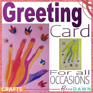
The new product covers are brighter, simplified, and they clearly highlight the contents. The fonts are mostly uniform, and not all screaming in a giant size. I've added a super-narrow font, and smaller print, too--for that crucial type hierarchy that had eluded me.
The product covers are designed with a color scheme--orange for teacher guides, blue for behavior management, and so on. When you scroll through a carousel of stuff, even on a tiny phone screen, I'm easy to find.
Just as easy to find as your favorite brand of chips on a store shelf!
Branding has changed my life. I think in terms of branding (and sometimes dream about it, too!), and it's starting to shape my ideas. I'm shaking off clutter everywhere!
I use consistent designs, fonts, colors, and phrases in all my marketing, whether it's at my store, Pinterest, or facebook.
Thank you everyone, for supporting my store over the years. You knew me when...(uhhh, let's not look back!)
And thank you, Erin from E is for Explore, for bringing your graphic design genius to the party!


